Wednesday 30 January 2013

Smart Exhibition @ TarraWarra

Container Train in Landscape
The Jeffrey Smart exhibition at TarraWarra (near Yarra Glen) is still on until the end of March, and it is well worth a visit. At this time of year it is a pleasant day out: enjoy a drive through the Yarra Valley, visit the exhibition, have lunch at the gallery's café or at one of the many other places in the area where they cater for the tourists from the Big Smoke.

Jeffrey Smart with his last documented painting, "Labyrinth", 2011
Jeffrey Smart announced his retirement from painting last year - he is ninety years old, wheelchair bound and rather frail. He still lives in the Tuscan villa where he has spent the last forty years with his partner Ermes De Zan.
Container Train in Landscape (detail)
The works on display in the Gallery's three main rooms are nominally divided into three periods, covering the painter's sojourn in Sydney from 1951, Rome in the 1960s and Tuscany from the 1970s on.

He is an Adelaide boy, having grown up during the Great Depression in a small flat on South Terrace, after his parents had to rent out their suburban house due to straitened circumstances. From the flat he could look out at alleyways and back lanes, rooftops and little side streets: an urban landscape that fascinated him. The geometry of the buildings spoke to him, and he loved to explore these alleys and laneways with his friends after school.
Yarragon Siding
He became an art teacher because his parents could not afford to send him to University to study architecture. However, his fascination with the composition and geometry of buildings, streetscapes and industrial areas have made him a master of the urban landscape. His works emphasize clean lines and precise attention to detail. Chevrons, parallel lines and geometric curves are features of his paintings. The cubist patterns of apartment blocks are complemented by the coloured squares and circles of road signs at construction sites and airports, and his portraits are set in those backgrounds rather than the more conventional setting one would expect of a portrait.
Portriat of Clive James
 "Portrait of Clive James", for example, shows a vast expanse of bright yellow corrugated steel in the foreground, dwarfing a small, distant figure showing above the parapet of an overpass above. Clive James or Franz Kafka, who can tell?  Similarly, "Alma Mahler Feeding the Birds", shows a tiny figure in a red coat, who may or may not be Alma Mahler, standing behind a railing on what appears to be an elevated roadway, while seagulls wheel in the foreground.
Alma Mahler Feeding the Birds
David Malouf is shown at an industrial site, wearing overalls and holding an orange fuel pipe. With the line of windows in a background building rising out of the top of his head, his figure forms a vertical that intersects with the horizontal line of a row of multicoloured containers, while the fuel pipe describes a parabolic curve in the foreground.
Portrait of David Malouf
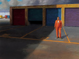
Many of the paintings have figures in them, but there is always a certain sense of isolation, that reminds me of Edward Hopper's work. The figure is often that of the painter himself (he has a bit of an Alfred Hitchcock silhouette!) In one painting, he has given his friend Bruce Beresford a cameo role, standing outside a row of garages, wearing a bright orange overall. I say "cameo role" advisedly, because his paintings have a theatrical quality - they give the impression of a stage set, with an actor hitting his mark. He likes a dramatic sky: looming grey clouds of enhance the theatrical effect, but at the same time they serve to focus attention on the structures below.
Bruce Beresford
I recognised Cahill Expressway, which has been one of the showpieces of the NGV these fifty years: a portly figure in a blue suit standing near the expressway on-ramp.
Cahill Expressway
 Whenever I go to see an exhibition, here or in another Australian city, something on loan from the NGV is always included. It just makes me grateful, yet again, that we live in Melbourne where we have unlimited, free access to such a wonderfully representative collection as that of the NGV. Whatever painter, school or genre is your cup of tea, you can go and enjoy it down St Kilda Road any time you like. Free of charge. Take the kids. Better than Disney.
Morning Practice, Baia
Another work that I liked is Morning practice, Baia, depicting a man on his back, balancing a cube on this feet. Sunlight floods the picture, which is, like many of Smart's works, almost surreal.
Container Train in Landscape
My favourite painting in that show was Container Train In Landscape, on five panels, each four feet long. This picture's home is the foyer of the Arts Centre, where I am sure most of  our members have seen it many times, but it was an unexpected pleasure to see it on a long white wall all by itself. The verticals of the gum trees reminded me of Fred Williams' work, but the bright primary colours of the carriages is pure Jeffrey Smart.

Labyrinth (2011), a metre-square picture, is Jeffrey Smart's last documented painting and is exhibited here for the first time.  It shows a vast stone labyrinth that stretches to the horizon, with a solitary figure standing in it. It evokes the painter's vision of that maze of back streets that he found so fascinating as a child. This return to the childhood experience that started him on his creative journey, may well be a fitting full stop to the Jeffrey Smart oeuvre.

Saturday 5 January 2013

Radiance: The Neo-Impressionists


I would urge our members to visit this exhibition, which is at the NGV International until 17 March 2013. There is a range of pointillist works on display: not only by the main protagonists, Seurat and Signac, but also by a host of other exceptional artists: Pissarro, Maximilien Luce and Théo Van Rysselberghe among them.

I particularly liked the works by Luce and I went back to look at them a second time. The colours are glorious. Théo Van Rysselberghe's portraits also stood out, as did the collection of sublime seascapes in the dazzling light of the South of France.

The pictures in this exhibition can never be seen to their best advantage in black and white, which is why you should enjoy them at first hand. Pay a leisurely visit to our magnificent art gallery: enjoy the Radiance show, have lunch, browse the art books and postcards in the shop, enjoy a cup of tea and a biscuit in the Members' Room, stroll through the Textiles Rooms on the top floor to see the display of beautifully designed ballet tutus. Go home with a smile on your face. It's as good as a couple of Prozacs and a stiff gin, and no side effects!
This exhibition is aptly named: the paintings are really radiant - they seem almost luminous. We are accustomed to the light and colour of the Impressionists, who obtained their effects by physically mixing the pigments on the palette. The Neo-Impressionists believed that to achieve the maximum luminosity of colour, it is necessary to present the pure colours separately and allow the viewer's eye and brain to blend them.

Georges Seurat founded the style of Divisionism, in which he divided shades of colour into individual dots of pure colour placed side by side. He took a scientific approach, concerned with colour theory. Divisionism developed into Pointillism, which is founded on the same principle, but is focused less on the pure technical aspect and more on the specific style of brushwork.

The reason why the pointillist paintings of the Neo-Impressionists seem brighter that those of painters who mix their pigments before applying them to the canvas, is partly because some of the white background remains visible between the dots, but mainly it is because placing the pure colours side by side on the canvas, avoids using subtractive colour.

This is where the technical colour theory comes in: when pigments are mixed, the resultant shade is achieved by partially absorbing (or subtracting) some wavelengths of light and not others. The mixed colour we see, depends on which part of the spectrum is not subtracted, and therefore remains visible.

Looking at the glowing pictures in this exhibition, the theory certainly seems to work! Of course, the downside of pointillism is that you don't have the brushwork that gives texture to a painting.

Another departure from the Impressionist way of working, is that the Neo-Impressionists eschewed the idea of painting en plein air, placing the impressions of light and colour on the canvas as the artist saw them. The Neo-Impressionists made sketches and drawings and they painted small studies which they then used to complete their paintings in the studio. In a way that brought them back again to the classical traditions shunned by the Impressionists.


Thursday 3 January 2013

Francis Bacon in Sydney 2012-2013


There is still time to see the marvellous Francis Bacon exhibition at the Art Gallery of NSW! I made the pilgrimage to Sydney before Christmas and was richly rewarded for my effort.

Francis Bacon was a very prolific painter (one has to wonder how he found the time to ghost-write all Shakespeare's plays for him, not to mention the sonnets.)

There are more than fifty of his major works on show, including a number of the iconic triptychs. The scope of the exhibition covers the development of his career through five decades. We have not been fobbed of with minor works - these paintings have been sourced from major collections, including those of the Tate in London and MOMA in New York. I also saw an old friend: the NGV's "Study from the Human Body", which our members will know.
"Study From the Human Body", in the NGV, Melbourne

The exhibition includes many portraits, mainly of friends and lovers, but there is also one of the "Screaming Pope" series of Pope Innocent X, after the Velasquez portrait that obsessed Bacon.
Pope Innocent X by Velasquez, and Bacon's Screaming Pope

That screaming mouth appears in many of his works - I was interested to read recently that Bacon was fascinated with Sergei Eisenstein's "Battleship Potemkin" and that he constantly reproduced the open-mouthed scream of the injured nurse with the runaway pram on the Odessa Steps.
Screaming nurse from Battleship Potemkin

The various elements of that scene on the Odessa Steps have been referenced in so many films, paintings and novels that Eisenstein would have been a millionaire, had he received royalties. To my mind, Battleship Potemkin should rank above Citizen Kane in the All-Time Great Movies list. But I digress, we are not here to do film reviews.
Portrait of Lucian Freud

Bacon and his friend Lucien Freud painted each other many times, and there was indeed a portrait of Freud on show, but I thought it didn't look a lot like him. When I read the wall text, I saw why. Lucien Freud didn't actually sit for this portrait, Bacon painted it from a photograph. Couldn't be bothered to hunt up a photo of Freud, so he just used one of Franz Kafka that happened to be handy. (I'm planning to commission Agata to paint my portrait, as soon as I can find a good photo of Elle MacPherson.)
George Dyer's death

Bacon's violent, drug-and-alcohol-addicted lover George Dyer was the subject of several works in the exhibition, including one of the harrowing triptychs Bacon painted after Dyer's death in a hotel room in Paris. The life force leaking out of his contorted figure forms pink, amoeba-like puddles on the floor. (Another of those post-mortem triptychs, depicting Dyer writhing in agony on a beach, was sold in 2008 at Christies for $44 million.)
Photo of Henrietta Moraes, from FB's studio, and the painting from it.

I particularly liked a nude of Henrietta Moraes, a rather louche model and muse for several leading British painters of the Fifties. Lucien Freud, with whom she had a torrid affaire, painted three portraits of her and Bacon painted her at least a dozen times. This picture shows her lying on a rumpled bed, seemingly tipsy and exuding an air of sexual invitation. For a man with a gay S&M lifestyle, Bacon certainly managed to infuse his portraits of women with a lot of highly charged sexuality.

Most interesting was a row of vitrines displaying photographs of Bacon's chaotic studio, and some of its contents: references that he used for his work, including medical texts featuring horrible disfigurements and skin diseases, magazine clippings, newspaper cuttings and photographs that he used when painting portraits, all crumpled and paint-spattered, the better to contort the faces he was painting.
Self portrait

Bacon is not for the faint-hearted. His paintings are dark and disturbing, with a visceral beauty that fascinates even as it repels. Those who can look past the brutally distorted images and be receptive to the raw emotion in his vibrant and powerful paintings, will enjoy a very satisfying experience.